

Same Plate, Different Color: Why Batches Drift
The plate has not changed and the ink supplier has not changed, yet the color sits off. Drift is normal; the question is how much counts as out.
A customer puts last month's labels next to this month's and says the color is wrong. The plate is checked and has not changed. The ink supplier is the same. This conversation happens in label plants most weeks.
Where the drift comes from
Ink is the first variable. The same product varies slightly batch to batch in pigment dispersion, viscosity and drying speed. Ink that has sat in storage loses solvent, thickens, and lays down a different film on press.
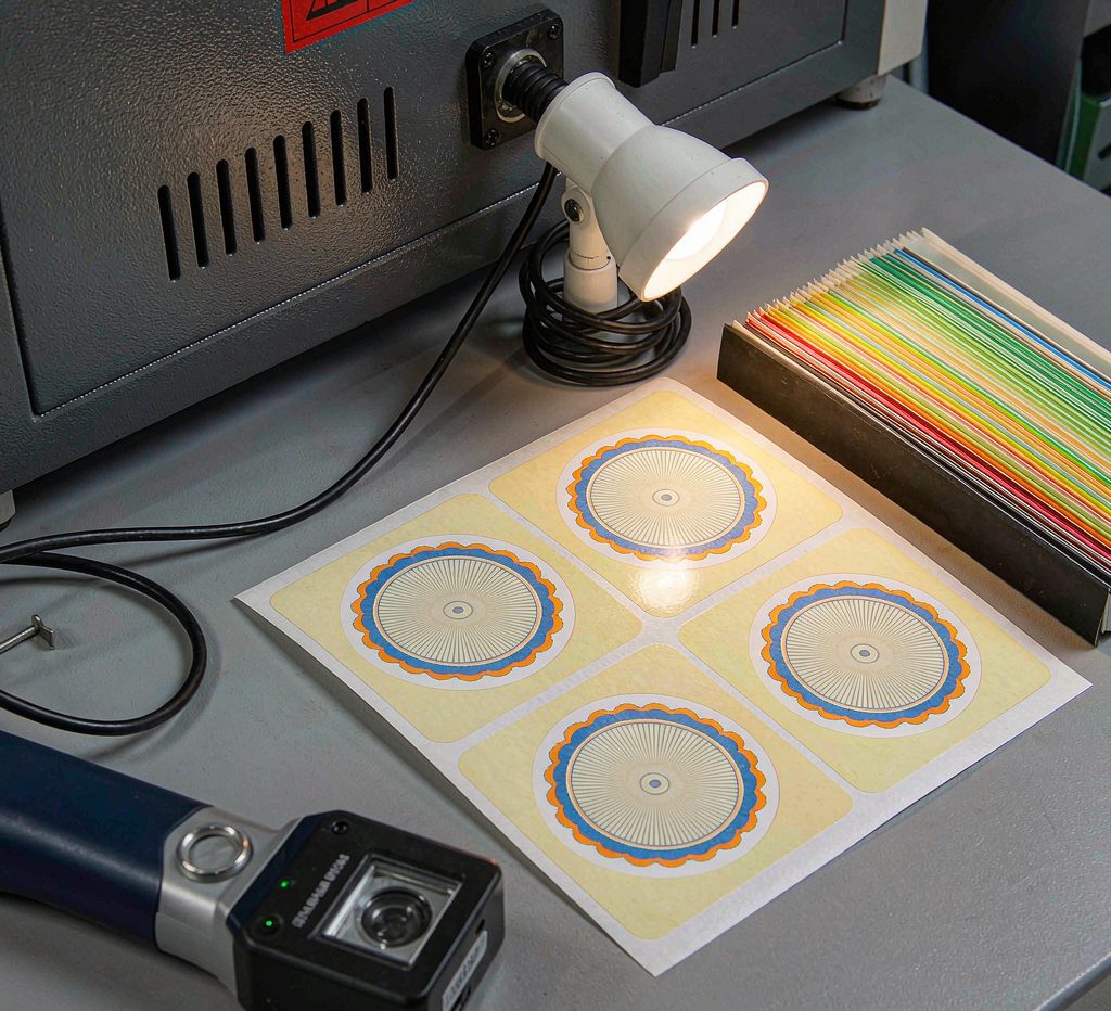
Print pressure is the second. Too much pressure squeezes ink outward, dots gain and the color goes dark and muddy; too little leaves the transfer incomplete and the color goes pale and dry. On one line, changing a roll of stock or adjusting tension can shift pressure with it.
The anilox roll is the third. Flexo meters ink through that roll, and as it wears or clogs, ink volume drops. Solid areas show it first, going grey and uneven.
Then material and environment. Batches of the same coated paper differ in whiteness and absorbency, so the same drop of ink reads differently. In a humid shop water-based ink dries slower, and a second color laid over ink that has not set produces a muddy mix.
How much counts as out
The eye is the least reliable instrument. One color under daylight, office lighting and a shelf spotlight reads three different ways. Judging color needs a standard light source or a spectrophotometer.
The instrument reports a color difference, usually written as delta E. In practice a value under two is close to invisible, two to three is noticeable but tolerable, and above three attracts complaints. Those lines are not absolute: neutral greys and beiges are the most sensitive, while strong reds and blues forgive more.
Which is why the acceptable range belongs in the order. Leave it out and both sides judge by eye, and the argument never closes.
Pinning the color down
Proof approval works best. Print one real sample before the run, get it signed, and that sheet becomes the reference for every later batch, one copy each side, stored away from light.
For spot colors, a number beats a description. "A bit deeper, a bit redder" means different things to different people, while a Pantone reference or a physical chip gives both sides the same target. Colors built from four process inks will not match a spot reference exactly, and that needs saying early.
Use one ink batch where possible. On a long-running job, buying the whole requirement in a single batch removes the biggest variable. Short runs cannot do that, so the deviation has to be held inside the agreed range at the proof stage.
Check during the run rather than after. Pull a sheet every thousand and compare, and correct immediately. That costs far less than sorting rejects afterwards.
Three things the customer can do
Say what the reference is. Last batch, swatch book and the color on a design file on screen rarely agree, so one has to be named.
Do not judge color on a phone. A screen emits light with a completely different gamut from ink, so a decision made there will not survive the press.
Accept reasonable movement. Printing is a chemical and mechanical process, not a display output, and exact repetition is not available. A defined range is more useful than a demand for identical.
On repeat work Huaishi keeps three copies of the first approved sheet, one each for the customer, the press room and the warehouse, and every later batch is matched against it before the run starts.