

Why Production Color Drifts From the Digital Proof
The customer signs the digital proof, then questions the production color. Two processes mean built-in drift, so set the expectation first.
The digital proof comes off the machine, the customer glances and signs. Two weeks later the production run arrives and the color gets questioned. This dispute repeats across the label industry, and usually neither side is wrong. Digital proofs and production runs are two different processes, and identical color is impossible. What can be negotiated is how much drift, and in which direction.
Where the Difference Comes From
Digital proofs use toner or inkjet with a wide color gamut, flattering bright colors and gradients. Production on flexo or letterpress uses ink transferred through anilox rollers, with a different dot structure and ink film, and the same color values render differently. Highly saturated oranges, royal blues and vivid greens suffer most: brilliant on the digital machine, muted on the press. Spot colors behave similarly. The digital machine simulates a spot from four or six process colors, while production mixes the actual spot ink, and while the hue matches, lightness and saturation often do not.
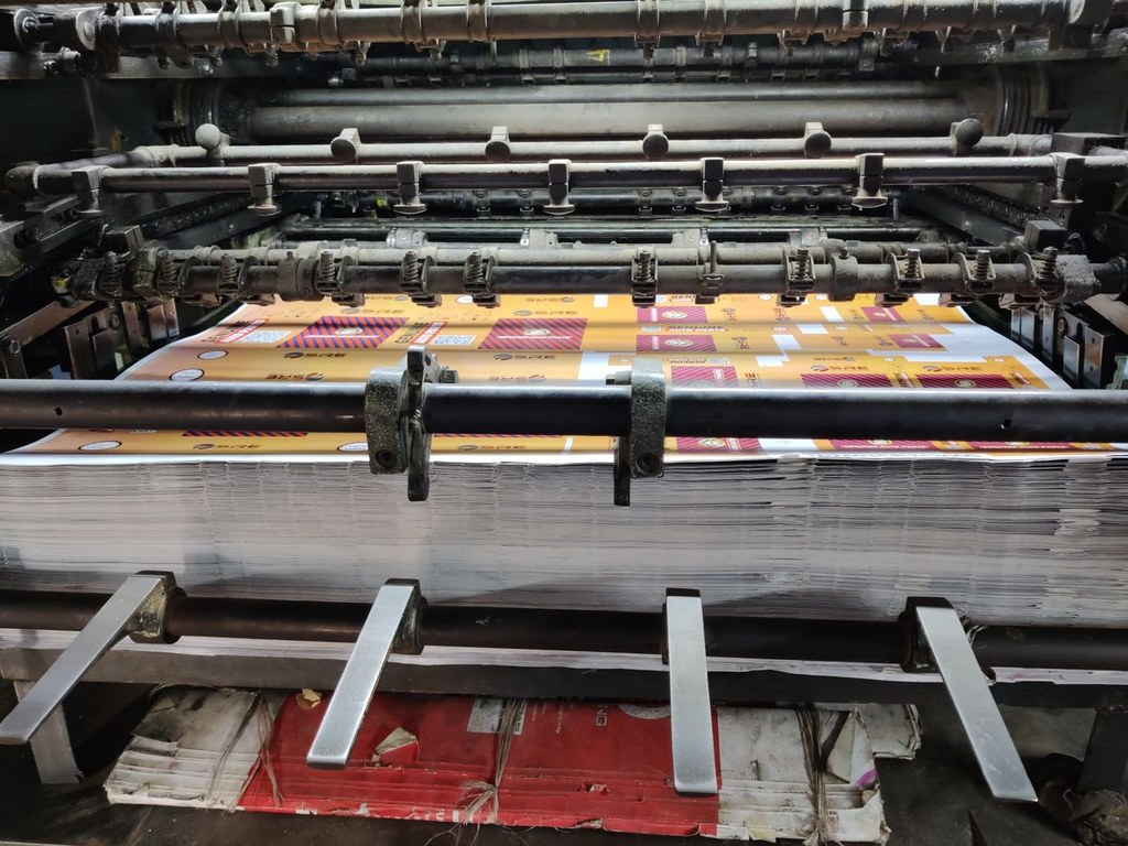
Material batches add a second variable. The same coated paper or film varies in brightness and gloss between lots, and printed color follows. Proof on March material, produce on September material, and another layer of drift stacks on.
What to Sign at Proofing
Since perfect match is off the table, the approval needs to pin the expectation. The industry practice is to set an acceptable color difference range, commonly expressed as a ceiling on the measured color difference value, tighter for brand colors and looser for ordinary commercial work. At approval, both parties measure with a spectrophotometer and record the values on the proof sheet. At delivery, the same position gets measured with the same instrument, and a value inside the range passes. This beats arguing by eye every time.
One more practice pays for itself: keep a production reference. When conditions allow, have the supplier pull a press proof from the actual production machine, even if it costs more and takes longer. If choosing between press proof and digital proof for a color-critical job, take the press proof and use the digital proof only to confirm layout and content.
How to Squeeze the Drift Down
From the source, a few rules. Run brand colors as spot inks rather than four-color builds, since spot ink batches hold far more stable than process builds. Both parties seal a first-article sample for key customers, noting production parameters, and reprints follow the sealed sample. Fix the material supplier and grade instead of chasing cheaper stock. Confirm the first article on press before running volume, with in-process spot checks. None of these is novel, but orders that follow all of them see color disputes essentially disappear.
At Xuzhou HuaiLion Electronic Technology we move the confirmation earlier. Color-critical orders get a digital proof for layout and content plus a press proof from the production machine, and scheduling starts only after both are approved. Deliveries carry color measurement data, and customers with their own instruments verify by the numbers once methods are aligned. Over the years, color arguments here have turned from debates into data lookups.
Notes for the Buying Side
Keep the signed proof after delivery. It is the reference for the next run, and without it every reorder starts a fresh guess about what the brand color looked like. Store it away from daylight, note the material and ribbon it was printed on, and write down any press-side adjustment that was agreed. Spot colors are worth naming in the job sheet too, since a CMYK mix that approximates a brand color can drift in a different direction from the original on the next substrate.
Two habits when reviewing proofs. First, view under standard lighting. Office warmth, window daylight and showroom spots each render the same proof differently, so approvals belong in a standard light booth. Second, screenshots do not count. An uncalibrated display makes a photo sent to the supplier saying the color is wrong a mostly useless communication. With these two habits plus numeric acceptance, the gap between proof and production stays controllable, and unboxing surprises end.